
Most BI tools start by asking “where is your data?” then spend an hour configuring it. EQQ inverts the flow: pick a query, pick chart type, done. The chart defaults are sensible out of the box — 400 px height, 800 ms animation — and every option is exposed if you need to adjust.
Start with your query — EQQ handles the rest
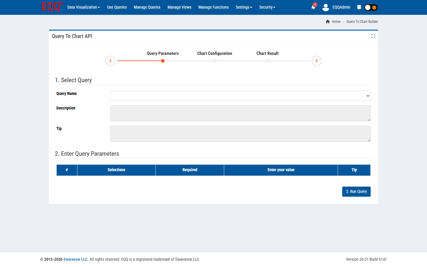
- Run your query in Use Queries.
- Click the Chart tab above the result grid.
- EQQ auto-classifies columns: dimensions (string / date) become axes, measures (numeric) become series.
- Adjust the chart type: bar, line, area, pie, scatter.
Full chart configuration options
Every chart exposes the following settings — all optional, all overridable per query:
- Chart Type — bar, line, area, pie, scatter
- Chart Height — in pixels (default: 400 px)
- Animation Speed — in milliseconds (default: 800 ms)
- Show Toolbar / Show Data Labels / Show Grid / Show Legend
- Enable Zoom / Enable Animations
- Bar Orientation / Bar Width (%) / Stroke Width (px)
- Curve Type / Legend Position
Chart types that work well
- Time series - date + numeric columns.
- Comparison bar - category + numeric columns.
- Composition pie - single row of percentages.
- Drill-down bar - two dimensions + measure.
Embed in dashboards
Every chart has a stable embed URL. Drop it in Confluence, a Teams tab, or a home-page card - the chart refreshes whenever the underlying query runs.
When to reach for Power BI instead
EQQ charts are great for operational dashboards that need freshness and role-based access. If you need cross-source modeling, DAX, or executive-grade storytelling, keep Power BI - and let EQQ be the governed source of one of its datasets.
Want more Information?

Ewarenow
Related Posts
-

-

Close Month-End Faster With EQQ
Jun 19, 2026 -


